Last year I completed my PhD studying interferometry for the detection of gravitational waves. My thesis is now available in electronic form that anyone that wishes to read it can obtain, and the source code is on GitHub. A paper copy - following the standard fabric-bound, A4 format specified by the university court - is available courtesy of the university library: at the time of writing, my thesis is stored in the research annexe on 29 Saracen Street (interestingly, that's not on campus, but near the Bowmore whisky bottling plant in the north of Glasgow).
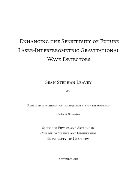
The title page of my thesis. Pretty, eh?
One of the ways in which I procrastinated while writing it was to try to produce diagrams, charts and figures which were entirely made from vector graphics such that they could be scaled for display or print at any resolution without losing fidelity. This was unfortunately due to rather of an obsession I have with data integrity: why throw away information when you don't have to? It might come in handy later. Information is lost in photographs when they are scaled up - for example in preparation for print. This is in general true of all *raster* graphics like the JPEGs, PNGs and GIFs used all over the web and in designs for print. Vector graphics typically look nicer when displayed in a PDF viewer at high screen resolution or printed with a high quality printer. There are downsides, and there is definitely an appropriate time and place for raster graphics, but not for most of the plots and diagrams in my thesis.
The upshot of all of this time spent making nice, scalable graphics was that it was possible to render the thesis in (theoretically) infinite fidelity for printing. My printed thesis graphics looked really nice in the A4 tome I submitted to the library, but the book design itself looked dated and boring. That's what gave me the idea to investigate professional print services.

University of Glasgow approved book binding service from Downie Allison Downie in Partick, Glasgow. While the workmanship is good, the university-enforced standard design is boring. No thanks!
Publishing my book
My thesis is almost entirely made up of text, plots of data and diagrams. Almost all of the diagrams are vector graphics. The scant few raster graphics were of circuit board layouts (which could, in hindsight, also have been produced in vector format). I had no photographs, both because my work was mainly focused around simulations and designs for new, not-yet-built experiments, and because of my aforementioned dislike for raster graphics.
As I had written the thesis in LaTeX - a scripting language for documents - I realised it would be straightforward to resize my A4-formatted thesis into a nicer A5 size more suited for reading, and in the process lay it out the way I really wanted to instead of conforming to the boring old University of Glasgow approved format. If nothing else, I'd save on paper by decreasing the margins and text spacing to result in a book more like the ones you buy today. Don't you hate it when you have to turn the page so frequently?
So, what follows below is a guide to how I published my thesis as a nice, custom book.
Step 0: find an online book printer
The obvious preliminary step. After a bit of searching I found InkyLittleFingers, who had good reviews, made everything at their own factory (in Gloucester) and offered what seemed like a pretty comprehensive binding service that could be arranged completely online. Importantly, they are based in the UK, which cuts the cost of postage, allows for efficient communication regarding specifications, and provides a VAT exemption due the rules in the UK regarding book tax.
One of the appealing parts of InkyLittleFingers' offer was the level of passive support they provide in the form of guides on their website. They even have a YouTube channel with some video tutorials.
There is a comprehensive guide to designing the artwork for the book. "Artwork", as I learned from their helpful glossary (under "Useful terms" on this page), is the term in the book binding industry for the content you want printed. That means both the case (i.e. the front and back covers and the spine) and the book block (the inside pages) - the whole thing.
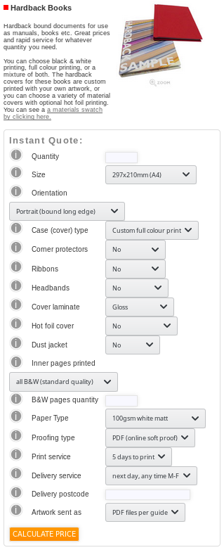
Form on Inky's website for creating hardback book orders.
The website is a little rough around the edges, and sometimes you might find yourself hitting a 404 or some other sort of error, but for the most part it works as intended. To order a book you first need to upload your artwork and ask for an automatic quote. As I wanted a hardback, I went to this quote form and filled in the details. You can guess the page count just to get a quote, but you need to know the exact page count before making a proper order. The page thickness you choose is combined with the number of pages you specify to calculate the spine thickness, which you then have to use to appropriately dimension your cover design. After some research of their FAQs, I chose the following options:
- Quantity: 4. Enough for my two supervisors, my parents and myself. It seemed that ordering a fifth made the price higher than five times the cost per book when ordering four. Maybe they prefer to make batches of 4?
- Size: 210x148mm A5.
- Orientation: portrait (bound long edge).
- Case (cover) type: custom full print colour. You can also choose a coloured cloth, but because I wanted to make a design for my cover I chose a printed form.
- Corner protectors: no. These would look a bit silly on a full colour cover.
- Ribbons: no. These are used for keeping your place in the book. They weren't yet available when I ordered, but I may have taken them if had they been.
- Headbands: no. These are little coloured ribbons that go above and below the paper block inside the cover. These would look weird alongside a glossy, printed cover.
- Cover laminate: gloss. As noted in the guide, gloss cases are not the same as standard glossy photo paper. That stuff has a mirror-like sheen that looks pretty ugly on anything but colourful photographs. "Gloss" is the de-facto cover laminate for most new books, contrasting with "matt" which is the duller variety. This one is personal preference.
- Hot foil cover: no. This is the gold or silver writing you put on standard theses. This only suits cloth covers.
- Dust jacket: no. I decided it's a bit pointless for a full colour cover to have a dust jacket: these are normally found covering cloth cases as a poor man's full colour cover. It would only have been a few pounds more to order them, though, and you can always remove them if you don't like them, so if you fancy it then go ahead.
- Inner pages printed: mixture of colour & HiQ B&W. My thesis is mostly black text, but some pages have colourful graphics. If you don't want a monochrome book, choose this, and you won't regret the high quality black and white. When you select it, it asks for a count of the black and white and colour pages, so you'll need to do that (just count the colour ones and subtract from the total to get black and white).
- Paper type: 100gsm matt uncoated white. You can get thicker, thinner, shinier paper, but I went for standard and I'm very happy with it. If you're publishing a chic novel you might want to go for cream.
- Proofing type: PDF (online soft proof). This was the only option for me; it's possible other options exist for higher order quantities. If you want a "real" proof to check everything looks good in print, you need to order a single copy with the same form. See the note on the PDF proof later.
- Print, delivery, postcode service: tailor these to your requirements. I went for the (cheapest) defaults as I was not in a hurry.
My order ended up costing around £79 all-in, or just under £20 per copy. Considering that binding the single, "official" copy of my thesis for the library to the official university format cost £26 at one of the recommended companies, even having provided them with the printed pages to use, I consider that a pretty marvellous deal. That's especially true given the creative control I was allowed.
Once you submit your order, the site works out how thick your book will be. Thicker books cost more to make and send, but more importantly you need the exact dimensions to use to design your case artwork in the event that you chose to make one yourself. The thickness of the spine is obviously determined by the number of pages and the weight of the paper, but also the type of cover you specify.
You are given an automatically generated note with your quote. In my case it said:
NOTES:(1) Please make sure you read the online help explaining the differences between standard and high quality black and white printing. (2) Spine width is approximately 21.8mm. (3) Case artwork dimensions, height: 234mm, width: 345.8mm. (4) Dust jacket (if ordered) artwork dimensions, overall height: 222mm, overall width: 491.8mm, front/rear cover width (each): 154mm, flap width: 77mm. (5) If there is anything that you do not understand in this specification, please contact the helpdesk. (6) Please make sure that you read the artwork preparation guide before placing your order.
So, my spine will be 21.8 mm. Given that I selected A5 paper, the case artwork needs to be equivalent to two A5 sheets next to each other, plus the spine, plus some extra bleed. For me, it was 345.8 × 234 mm (width × height). That budget breaks down as:
- Two A5 pages: a single A5 page is 148 × 210 mm (width × height), so I need 2 × 148 mm in width, i.e. 296 × 210 mm
- The spine: 21.8 mm, as defined above, added to the overall width, i.e. 317.8 × 210 mm
- Extra 28 mm (width) and 24 mm (height) bleed, i.e. 345.8 × 234 mm. Note that you get grooves at the spine, where the glue that attaches to the inside paper ends, allowing for flexibility at the spine. This makes the actual A5 covers slightly wider. This adds to the extra width you need to account for.
The equations for the dimensions are, essentially:
- Total height = book block height + 24 mm, so in my case the height is A5's 210 mm + 24 mm = 234 mm.
- Total width = 2 × book block width + spine width + 28 mm, so in my case the width is 2 × A5's 148 mm + my spine's width of 21.8 mm + 28 mm = 345.8 mm.
The "hang over" of the cover over the book block. This is an extra 4 mm of material that helps to protect the pages of the book.
The extra 24 mm (height) and 28 mm (width) are required to allow the design to fit the cover. The budget for the extra width (28 mm) breaks down as:
- 8 mm used to wrap the cover artwork around each edge of the book (16 mm total)
- 6 mm used to allow the cover to "hand over" the paper, and to allow for extra material for the two "grooves" at the book's spine (12 mm total)
The budget for the extra height (24 mm) breaks down as:
- 8 mm used to wrap the printed design around the edges, as above (16 mm total)
- 4 mm above and below the book block height to allow the cover to "hang over" the paper
Step 1: design the cover
If you choose to provide custom cover artwork like I did, you need to create a PDF of the correct size and upload it alongside your book block. Fortunately, Inky provide a video tutorial showing how to achieve this with the free, open source design software Scribus. Fantastic! It's easy to set the dimensions in Scribus using guides, which help to define the area you need to provide artwork for, and show what will and will not be visible on the front, back and spine of the book. The video walks you through calculating the dimensions of each part of the cover (as I also listed above), so you're finished with a grid of guides showing each area.
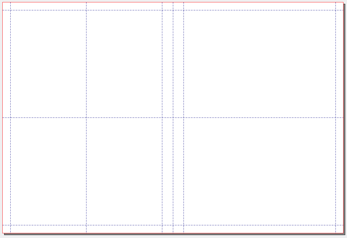
Guides for my A5 book in Scribus. In addition to the standard margins, I added guides to show the horizontal and vertical centre lines to assist with placing text and graphics.
Of course, the trickier bit is actually coming up with a cool cover design! For that, you're on your own, except a note that you should design your cover with the back on the left, so that when folded over the book the text still reads the right way up.
Here's what I came up with:
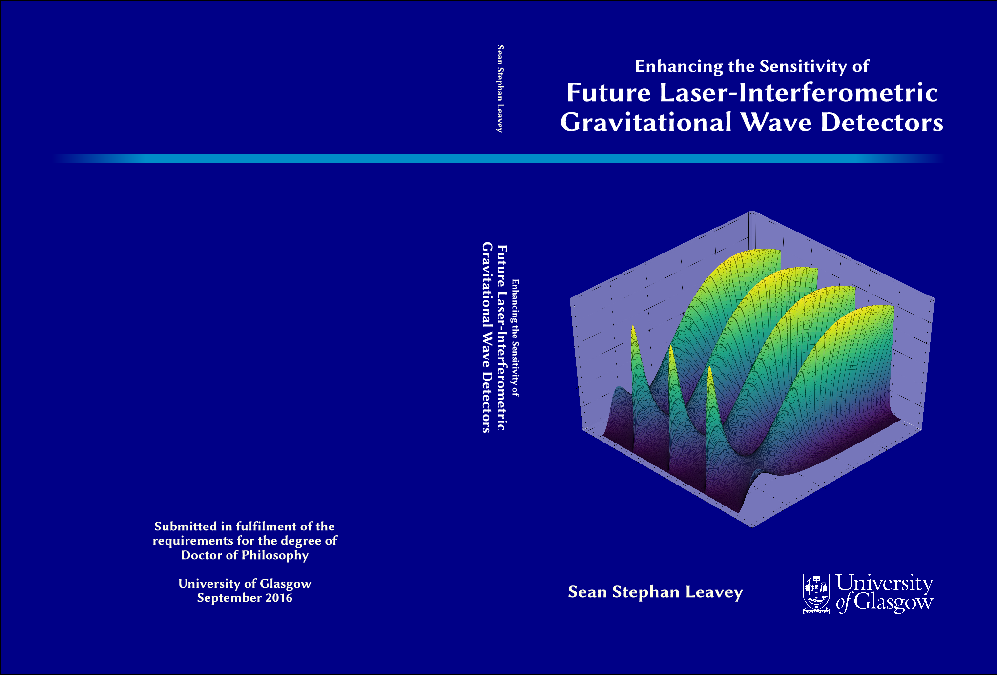
My thesis cover design.
I'm no design pro; I have the creativity of Status Quo when it comes to art. I included the usual stuff: the title and my name on the front cover and spine. I also added a generic picture related to my work*, prettified for the front cover with the removal of the labels, tweaking of axis limits and the use of a nice complementary colour wheel (it took a very long time to render, but that's a story for another time). Tempted as I was, I decided against adding the thesis abstract to the back - this is not a novel. I managed to find a nice vector graphic of the university's logo, so I added that to the front cover opposite my name. The background is a nice bold blue - my favourite colour. I'm quite happy with it!
*For anyone that is wondering, it shows a surface map of the power of the error signal from the second RF control sideband in the signal recycling cavity of ET-LF as the Schnupp asymmetry and exact cavity length are tuned (see Chapter 7).
Step 2: compile the pages in A5 format
I spent over half a year writing my thesis, formatting it for A4 paper as I went along. LaTeX, however, takes most of the control over page layout away from the user and uses algorithms to decide where to place text, figures and everything else. This generally works quite well, but occasionally has issues, especially when your text is figure-heavy. I found that changing the paper size from A4 to A5 led to some unintended blank pages at the beginning or end of chapters and sections, and small figures hogging their own page. Some of these issues were because of blank pages I had added when it was formatted for A4, which were no longer appropriate for A5, so let's not blame LaTeX too much. Some of them, though, necessitated moving the figure definition in the source code to force LaTeX to alter its positioning behaviour, which is a bit more time consuming.
I had to go through the whole document and fix these as they occurred. To prevent wasting time in a recursive doom fixing one part and breaking another, I did this sequentially from the start. Whatever you do, don't just fix layout issues at random as you find them - you'll no doubt break the layout later in the document.
Naturally, going to a smaller paper size while maintaining the margin and font sizes leads to extra pages. Going from A4 to A5 in my case, the page count went from 244 to 271 - not as much a jump as I expected. As I did not alter the text size, the relatively small increase in page count is probably due to the page-spanning figures taking up less physical real estate where otherwise text could go. Put another way, the ratio of the graphic dimensions to the text dimensions was reduced.
Step 3: upload the sources and proof the full book

The PDF proof of my book generated by InkyLittleFingers. The cover is naturally larger than the rest of the book, as it has to wrap around the two cover pages and spine. The proof contains bleed marks, where the paper will be cropped after printing (to allow graphics to "bleed" over the sides of the paper, so that when it is cut the graphic is flush with the edge).
After creating the order (and paying!) you need to upload your work. The book block (the pages of the book) is uploaded as a separate document to the case artwork. In my case, the book block was a PDF compiled with LaTeX, and the cover was as PDF exported from Scribus. I thoroughly examined these documents before uploading, but the main check to make is of the automatic proof that InkyLittleFingers generate for you after uploading. It contains the case artwork and book block rendered as you will see them once printed: with the colours set, the pages appropriately sized, the fonts chosen and the images appropriately cropped. Check this proof thoroughly - this is exactly what you'll see, minus the marked bleeds, when your printed books arrive.
In my case, the automatic proof contained a few small artefacts on some diagrams. I phoned Inky to verify where this was coming from, as I was not sure if this was just an effect of my PDF viewer. It turns out that they were real, and somehow produced by their systems: the book block I uploaded did not contain these artefacts, but only the proof generated by them. In hindsight, though, I doubt it is a bug with their own software, but rather some bug with the way that the Adobe PDF format handles embedded graphics. The worst artefact I found was in a graphic that was itself a PDF embedded within the PDF book block. This was originally generated with Inkscape using a library of SVG parts themselves made with Adobe Illustrator. Somewhere along this myriad format conversion process something happened that led to this artefact in the final version.
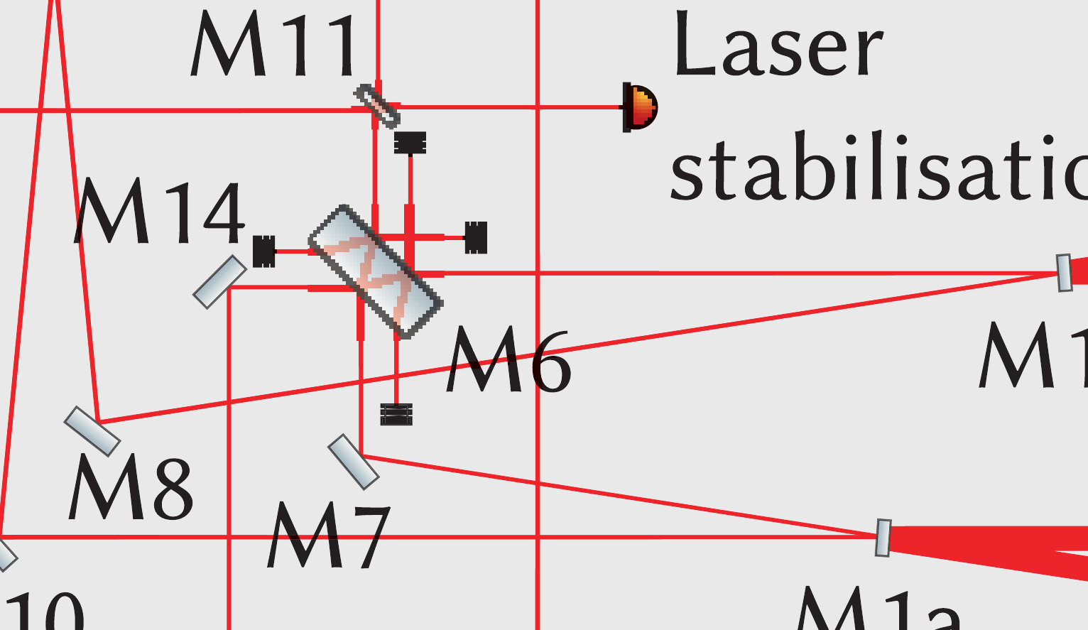
One of the minor artefacts in a vector graphic within the book block. The beam splitter - designated "M6" - should not have pixellated edges. Indeed, the source file I generated the graphic from does not have this artefact - it's only when I got the proof from InkyLittleFingers that it appeared.
I never found out the culprit for the artefacts, but I did manage to get rid of almost all of them by playing with the SVG sources in each case. Flattening images from many layers to one, and merging overlapping segments were two strategies that seemed to work.
The nice thing about the Inky interface is that you can continually upload new book blocks and case artworks and generate new proofs until you are happy. I did this at least three times, gradually getting rid of all of the artefacts, until I was happy. In the end I left the worst artefact in, as I had managed to make it better than to begin with and it was very, very minor and hardly noticeable. My last hope was that it would not appear in the final print despite the proof.
Once you sign off on the final proof, Inky get to work making the book. Now the waiting begins!
Results
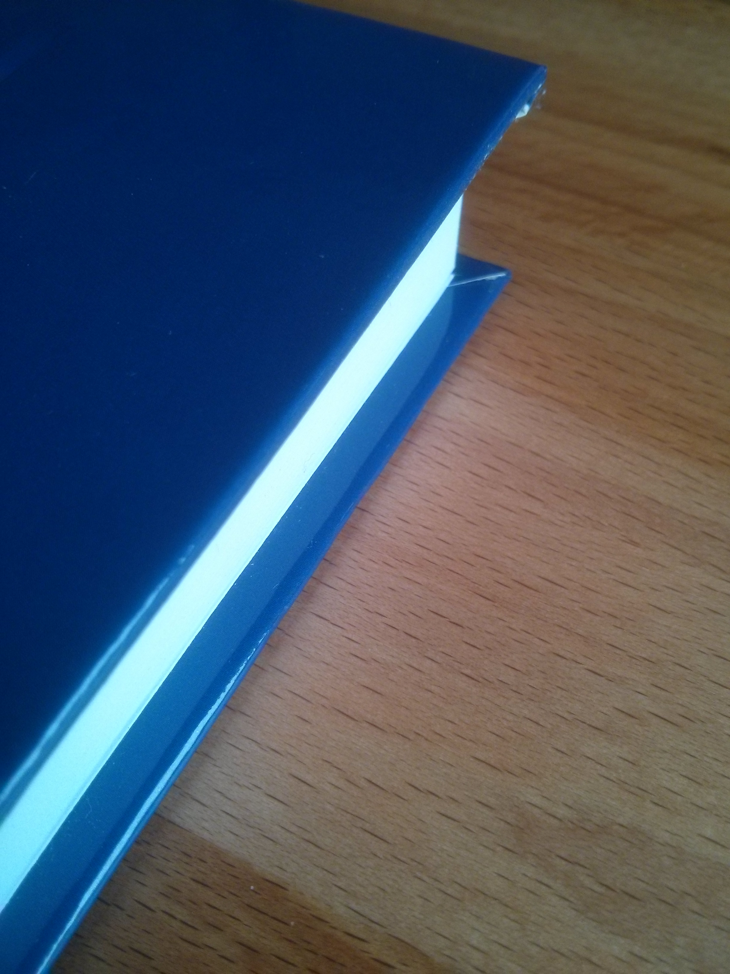
After about a week, I got the books in the post. Accompanying the delivery was a note saying that I should wait at least 12 hours before opening the pages fully; they are apparently immediately dispatched after production so there's a chance the glue might not have fully set if the delivery was unusually quick. I was so eager to look at my creation that I did open one copy - the one I intended to keep myself - and it seems in hindsight that it didn't do any damage.
The black and white pages were printed to very high standard.
The quality is superb. The whole book seems tough and durable. The book as a whole feels sturdy. The glue is neatly applied to the paper block, which is firmly glued to the inside of the case, over the edges of the cover which are tucked properly in place. It easily sits free-standing on its narrow side, able to sit on a shelf and support its own weight. The binding of paper and cover has been achieved flawlessly, and the book block sits exactly in the middle of the cover. The paper quality is great. The print fidelity on the black and white and colour pages is equally excellent. I am extremely pleased and impressed with the results, especially given the price I was charged.
The artefact mentioned above was, while present in the final print, hardly noticeable (see photo below). It was more than offset by the superb print quality for the diagrams and images (and indeed text!).
Highly recommended!